Appetite by Design: What Oyster to Go Taught Me About F&B Branding
- Apr 14
- 3 min read
How a fragmented F&B brand became a clear, consistent customer experience — across every touchpoint.
There's a moment every F&B owner knows — the one where a customer stares at the menu a little too long, then orders whatever they already recognise.
That moment has a cost. Not just in that visit, but across every visit where the brand isn't guiding the decision.
This is the story of how Oyster to Go — a dine-in oyster bar in Tsim Sha Tsui, Hong Kong — stopped leaving that moment to chance.
Good design looks good. Great design makes choices easier.
Role: Lead Visual Strategist
Client: Oyster to Go, Hong Kong
Scope: Menu Engineering · Visual Identity System · Print Collateral · Retention Design
Deliverables: Menu · Stamp Card · Leaflet · Business Card · Table Paper ·
01 // The starting point
The product was exceptional. Thirty varieties of oysters sourced globally — France, Ireland, Australia, Scotland, the USA. The kind of range serious seafood diners travel for.
But the menu looked like a spreadsheet.
Thirty items in a numbered list. Black text, white background, no imagery, no hierarchy. Every oyster had a description — but nothing told the customer where to start, what to prioritise, or why any of it was worth $58.
The brand wasn't matching the product. In a competitive TST dining environment, that gap is where customers quietly decide to go somewhere else.
02 // The problem: fragmentatio

The problem wasn't design. It was fragmentation.
No visual hierarchy on the menu. Print materials that felt unrelated to each other. No thread connecting the in-restaurant experience to the brand's digital presence. Nothing to take away, and nothing to bring a customer back.
When a brand is fragmented, customers feel it — even if they can't name it. The result is visual friction: the invisible resistance between arriving and ordering with confidence.
03 // The approach: one system, every touchpoint

The brief was to make the brand work harder — not just look better.
That meant building a complete visual language and applying it consistently across everything a customer encounters.
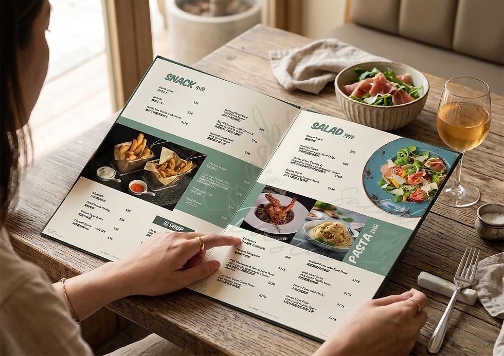
Menu engineering came first. The thirty oysters were restructured with clear visual hierarchy and food photography anchoring key items. The before and after tells the story better than any description — a numbered list became a navigable, appetite-driven experience.
From there, the system extended outward: stamp card, leaflet, business card, table paper, and social content — all unified under the same visual language. Not matching for its own sake, but consistent enough that every touchpoint reinforces the same brand impression, whether a customer finds the brand on Instagram or walks in off the street.
The stamp card completed the loop — a retention tool designed to feel worth keeping, and worth returning for.
04 // A note on market behaviour

This project was built for a Hong Kong audience, and that shaped every decision.
In Asian F&B markets, visual energy drives decisions. Rich imagery, deliberate colour, layered hierarchy — these actively stimulate appetite and accelerate the moment between browsing and ordering. UK markets tend toward typographic restraint, where whitespace signals quality and confidence.
Neither is wrong. But applying the wrong visual language to the wrong audience is a silent conversion problem — one that rarely gets diagnosed as a design issue.
Understanding which register your customer responds to is what makes a brand system actually perform.
05 // The Result

Six touchpoints. One cohesive system. A brand that now looks as considered as the product it serves.
The before and after images above show the shift more directly than any metric could — from a functional list to a brand experience with a clear point of view.
The measure that mattered: after the first phase was delivered, Oyster to Go returned to commission a second phase — an updated menu and revised stamp card as the brand continued to grow.
In F&B, a client who comes back is a client whose business moved. that matters most.
06 // What this means for your brand
If your menu, collateral, or overall brand presence isn't converting the way it should — the problem is rarely any single design piece.
It's usually the absence of a system: materials that feel disconnected, a visual language that doesn't match the quality of the product, a brand that looks assembled rather than considered.
These gaps affect more than aesthetics. They affect how quickly customers decide, how confidently they order, and whether they return.
I work with F&B brands to close those gaps — from menu engineering to full brand systems, built around how your specific customers actually make decisions.
Let’s Strategize Together: cindylai0110@gmail.com · cindylai.studio
Comments